
To have a successful website, you can’t just rely on numerical metrics like traffic. You need to have detailed insights into what users experience on your site.
Without improving your user experience, you can’t convert your visitors into loyal customers. User experience analytics helps you understand what visitors feel about your website.
In fact, apart from the content of your site and the product/service you offer, you have to pay attention to the way your site guides visitors.
Here, we’ll explain why you have to track UX and how you can use web analytics for user experience.
The Impact of UX on Your Website’s Performance
A good user experience on your site will greatly impact customer loyalty and future interactions of users with your brand. When you have a good UX, you’ll probably have high engagement and conversion rates.
Here are the reasons why you have to pay special attention to your website’s UX:
- Reach higher engagement
- Achieve longer sessions
- Reduce bounce rate and friction
- Increase conversions in your sales funnel
- Improve user signals and SEO
- Gain trust
- Increase return visits
What Are User Experience Metrics?
Web analytics tells you what users want from your website, but it doesn’t tell you how well your design and content match their intent. That’s where UX metrics become important.
Using these metrics, you can track the interactions of visitors and figure out how they feel about your website.
We can categorize user experience metrics into two groups: quantitative and qualitative.
Quantitative UX Metrics
Numerical and objective metrics are quantitative metrics and are almost similar to web analytics metrics.
In fact, quantitative UX metrics show what happens on your website and can give you a trend to measure the performance of your site over time.
Here are some of the most common quantitative UX metrics:
1. Task Success Rate (TSR)
The percentage of users who complete a goal on your site, such as:
- Signing up
- Checking out
- Downloading a file
If you have a low TSR, you have to look for friction in your interface, in your check-out process, or unclear instructions.
2. Time on Page
Time on page shows how interesting your content is. Of course, a low time on a page does not necessarily mean a problem because people might find the answer to their questions and leave the page immediately.
You have to be careful when interpreting this metric to determine whether the problem is from UX or the content itself.
3. Session Duration
Apart from the time users spend on a single page, you have to track the average time they spend on your site.
A longer session can mean engagement or show frustration, or even difficulty in finding information.
4. Page Load Time
People pay for high-speed internet to explore sites in seconds. So, if the page load time of your pages is high, visitors won’t stay on your site.
Faster pages have higher user satisfaction and lower bounce rates. This will lead to better UX and a signal of quality to Google and other search engines.
5. Bounce Rate
Sometimes people leave your site without any interaction, and this can be due to a poor UX. The bounce rate can measure this behavior. It’s the percentage of visitors who leave your site after viewing only one page.
6. Click-Through Rate (CTR)
This metric measures the percentage of visitors who click your links. It shows the quality of your calls-to-action.
A low CTR might be due to issues with UX factors like design visibility or placement. Of course, it might also be due to messaging or the product/service quality. So, you need to interpret it in the right way to find the problem.
Qualitative UX Metrics
User experience is more than just numbers. It’s about emotions, intent, and motives. So, apart from the previous metrics, you have to consider qualitative UX metrics to understand how visitors feel about your pages.
Here are some of the most important qualitative UX metrics:
1. User Satisfaction
The satisfaction of visitors is one of the most important factors for analyzing user experience on your website.
You can measure it using various metrics like:
- CSAT: It’s a Customer Satisfaction score and tells how your visitors are satisfied with your services or products.
- NPS: The Net Promoter Score tracks customer loyalty. In fact, it’s the answer of customers to the question: “How likely are you to recommend us to your friends?”
These metrics are actually a quick sentiment check and tell you how happy your users are.
2. Usability Testing Feedback
This is a method to measure how user-friendly your website is. In this method, you observe how your website’s visitors interact with it when they want to perform specific tasks.
Usability testing helps you detect problems that normal analytics and internal testing can’t reveal.
3. Heatmaps
To figure out what items in your page design are attracting users, you have to track where they click, scroll, or hover on a page.
Heatmaps are great qualitative UX tools that highlight elements and parts on your website that your visitors interact with. Also, they show what items are ignored by your users.
For example, if your visitors click an image or ignore an important button on your site, heatmaps will visualize that. This is especially useful for optimizing landing pages.
4. Session Recordings
Session recordings give you deeper insights compared to heatmaps. It will record a video of your users’ behavior and let you replay it to see their journeys.
It shows every action, including:
- Mouse movements
- Hesitation
- Scrolling behaviour
- Drop-offs
This gives you unique insights into user experience on your site and helps you optimize the design, CTA, etc.
5. Comments
You can simply ask users if they’re satisfied with your page. This is the most direct means of tracking user experience and improving your site.
The Best Tools for Measuring User Experience on a Website
Not all analytics tools are suitable for tracking UX metrics. Here, we’ve listed the top 5 analytics tools that are great for measuring user experience metrics:
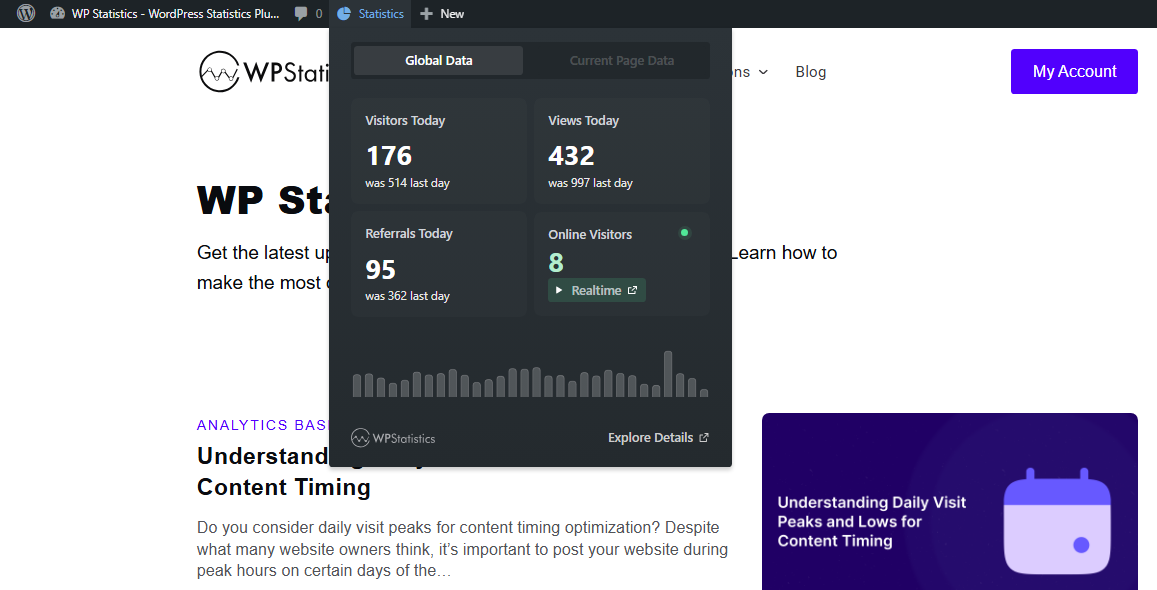
1. WP Statistics
WP Statistics is a WordPress plugin that can track many web metrics and analyze user experience.
The main advantage of using WP Statistics is that it gives you insights into your website’s dashboard without needing third-party tools.
Moreover, it’s privacy-focused, which means it doesn’t store highly personal information and doesn’t share data with other platforms for monetization.
So, if you want to track visitor behavior to improve user experience on your site without violating their privacy, it’s the best choice for you.
Key Features of WP Statistics
- Summary Report Tab: You can check a summary of your website’s performance as a toolbar on your site without opening your dashboard.
- Visitor Insights: It allows you to track your visitors’ behavior and list the most active users with detailed reports.
- Device & browser insights: You can see what devices, operating systems, and browsers your visitors use.
- Content Analytics: You can track top-performing blog posts.
- Keyword Tracking: WP Statistics can integrate with Google Search Console and track top queries.
- Custom Events: Set custom events on any parameters on your site to track any activity of users.
Pricing Plans of WP Statistics
| Plan | Price | Notes | |
| Free | $0 | Essential analytics features | |
| Add-ons | From ~$39/year | Data Plus, Marketing, Mini Chart | |
| Premium (All-in-One) | 1 site | $119/year | Includes all add-ons |
| 5 sites | $249/year | ||
| Unlimited | $449/year | ||
Pros of WP Statistics
✅ GDPR-compliant by default
✅ No need for cookie banners
✅ Privacy-friendly without external data sharing
✅ Easy setup on the WordPress dashboard
✅ No coding required
Cons of WP Statistics
❌ Marketing and campaign tracking features are not free
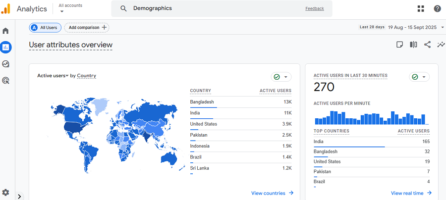
2. Google Analytics (GA4)
Google Analytics 4 (GA4) is the industry leader and offers the most complete set of analytics features.
It has an event-based approach and is great for tracking user behavior in campaigns, especially for large companies.
It provides deep insight into useful metrics, like engagement, traffic sources, and user paths. As a result, it’s one of the most reliable platforms for data-driven UX optimization. The good news is that you obtain all of these features for free.
Key Features of GA4
- Event-based tracking: It gives you insights into every user interaction, from clicks to scrolls.
- Funnel & path exploration: GA4 lets you visualize user journeys and identify drop-offs to optimize your sales funnel.
- Audience segmentation: It’s great for segmenting audiences and tracking their behaviors by device, geography, and user type.
- Integration with other Google Platforms: Using GA4, you’ll gain access to other tools, like Google BigQuery, Search Console, Google Ads Manager, Google Optimize, Google Ads, and Display & Video 360.
- Custom dashboards: Apart from standard reports, you can define custom reports for various dimensions and metrics, which is great for tracking user experience on your site.
Pricing Plans of GA4
| Plan | Price | Notes |
| Free | $0 | Full access for most users |
| Google Analytics 360 | Custom (enterprise) | Adds advanced modeling, SLAs, and support |
Pros of GA4
✅ All-in-one
✅ Scalable
✅ Customizable
✅ Free
✅ Powerful segmentation
Cons of GA4
❌ Crowded dashboard
❌ Privacy concerns
❌ Requires cookie consent compliance
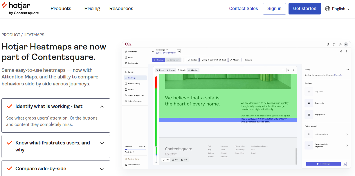
3. Hotjar
Hotjar is a simple but powerful tool for analyzing user experience on your website. It helps you understand how people use your website instead of just showing the numbers.
It’s famous for its great visualization that lets you see what your visitors do. So, you can track where visitors click and what makes them leave your site.
Moreover, a unique feature of Hotjar is session recordings, which allow you to watch user behavior on your site.
Hotjar is a great web analytics tool for detecting UX problems, like bad navigation, layouts, or calls to action.
Key Features of Jotjar
- Heatmaps: See where users click, scroll, or leave your site.
- Session recordings: Watch real-user journeys on your website.
- Surveys & feedback widgets: Request for user opinions and perform sentiment analysis to find UX problems..
- Integrations: You can connect Hotjar with thousands of other apps. It also works with GA, Slack, HubSpot, etc.
Pricing Plans of Hotjar
| Plan | Price | Notes |
| Basic | Free | Up to 35 sessions/day |
| Plus | $39/month | For small teams |
| Business | $99/month | More sessions, data retention |
| Scale | Custom | Enterprise features |
Pros of Hotjar
✅ Visual insights
✅ Clear and informative reports
✅ Easy to set up
Cons of Hotjar
❌ Sampling limits on free plans
❌ GDPR- & CCPA-ready
❌ Not ideal for complex analysis or large websites
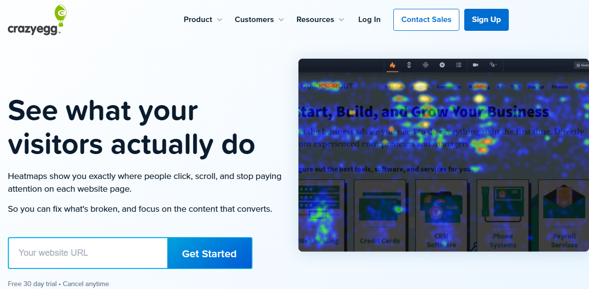
4. Crazy Egg
Crazy Egg is also a visual analytics tool that helps you track UX metrics on your website. The tool displays the results as colorful heatmaps and scroll maps. So, you can exactly detect where people click, move, and stop scrolling. It actually shows how users experience each page on your website.
Moreover, it offers a great A/B testing feature to understand how visitors actually use your website.
With quick A/B tests, you can compare different versions of a page and the way users interact with various headlines, button colors, or layouts. As a result, you can instantly see which one performs better and make smart design decisions.
Key Features of Crazy Egg
- Heatmaps & scroll maps: Find the most engaging parts on your website and where visitors drop off.
- Session replays: Watch user interactions in a session and identify friction points.
- A/B testing: Test different layouts and content and optimize your website accordingly.
- Traffic segmentation: Divide traffic data by various factors, including referral source or device.
Pricing Plans of Crazy Egg
| Plan | Price | Notes |
| Free Trial | $0 | 30-day free trial |
| Basic | $29/month | Up to 30k tracked pageviews |
| Standard | $49/month | Most popular plan |
| Plus | $99/month | For mid-sized businesses |
| Pro | $249/month | For large or high-traffic sites |
Pros of Crazy Egg
✅ Visualized UX tracking
✅ Simple dashboard
✅ Scalable for large websites
Cons of Crazy Egg
❌ Limited free options
❌ Less insights compared to GA4
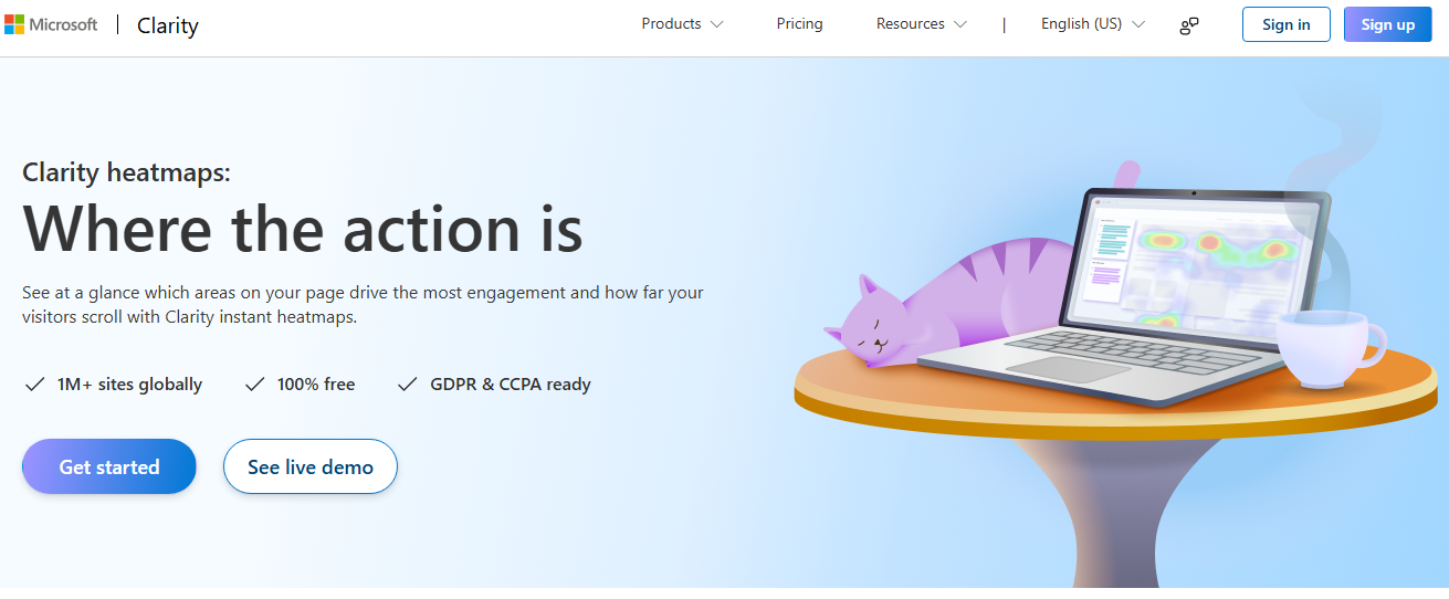
5. Microsoft Clarity
Microsoft Clarity is a free analytics tool that gives you a cool dashboard to track user experience for free.
It takes advantage of heatmaps and other visualized features to help you see how people interact with your website.
Clarity provides heatmaps, session recordings, and user engagement metrics that even beginners can interpret. Using the reports, you can easily understand where visitors click, scroll, or leave your website.
It can easily connect with GA4 to give you detailed insights about your website performance. But the tool itself offers features that you can’t find on GA4.
For example, you can replay real user sessions to find frustrations, broken links, or confusing layouts.
Key Features of Microsoft Clarity
- Session replays: Watch real user interactions and find UX issues.
- Click & scroll heatmaps: They help you find high-attention and ignored zones on your website.
- Rage click detection: You can use clarity to detect frustration signals and optimize your site accordingly.
- Performance metrics: Review important metrics like engagement time, quick backs, and scroll depth.
- Integration with Google Analytics: Combine its data with GA4 to have richer UX insight.
Pricing Plans of Microsoft Clarity
| Plan | Price | Notes |
| Free | $0 | Unlimited websites, unlimited sessions |
Pros of Microsoft Clarity
✅ Completely free
✅ No data limits
✅ Easy to set up
✅ Visual reporting
✅ GDPR and CCPA-compliant
Cons of Microsoft Clarity
❌ Limited advanced metrics compared to GA4
❌ Interface is too basic for power users
How to Improve UX Using Analytics Data
Here are some tips to use UX data and optimize your site accordingly:
- Identify High-Exit Pages: Find pages where users leave and try to improve their layout, clarity, or content.
- Detect Friction: Find problems with your site’s map and the navigation path toward the final goal. Then, try to simplify the path so that users can easily find what they need.
- Improve Content Engagement: Use scroll depth and time on page to see what your users like. Then, try to adjust both the structure and the content to improve user experience.
- Analyze Technical Issues: Find slow pages, broken links, large images, or unstable layouts.
- Track Mobile Usability: Review devices using analytics, and also make sure that your layout is suitable for smartphones.
- Use A/B Testing: Compare design variations to find the best version of your website in terms of UX.
Final Thoughts
Analyzing user experience is as important as tracking traffic for your website’s performance. You have to know what your users like on your site and what they hate.
So, it’s essential to track UX metrics to find friction on your site and optimize it accordingly. Tools like WP Statistics and Hotjar help you monitor user experience using quantitative and qualitative metrics and audit your site.
You need to combine web analytics metrics and UX tracking results to have a complete understanding of your site’s performance. If you need more info in this regard, don’t hesitate to contact us.
FAQs
How to analyze a website in UX?
You have to review quantitative and qualitative UX data on your site. For example, you have to monitor metrics, like page speed and navigation paths, along with heatmaps and session recordings. This helps you identify friction to optimize your site.
What is user experience analytics?
User experience analytics help you understand how users interact with your site. Using UX data, you can find what users do, what they like, and what they don’t like about your site.
How to track user activity on a website?
You can track user activity using analytics tools like WP Statistics, Google Analytics, or Hotjar. These platforms can monitor clicks, visits, scroll depth, navigation paths, and session recordings.