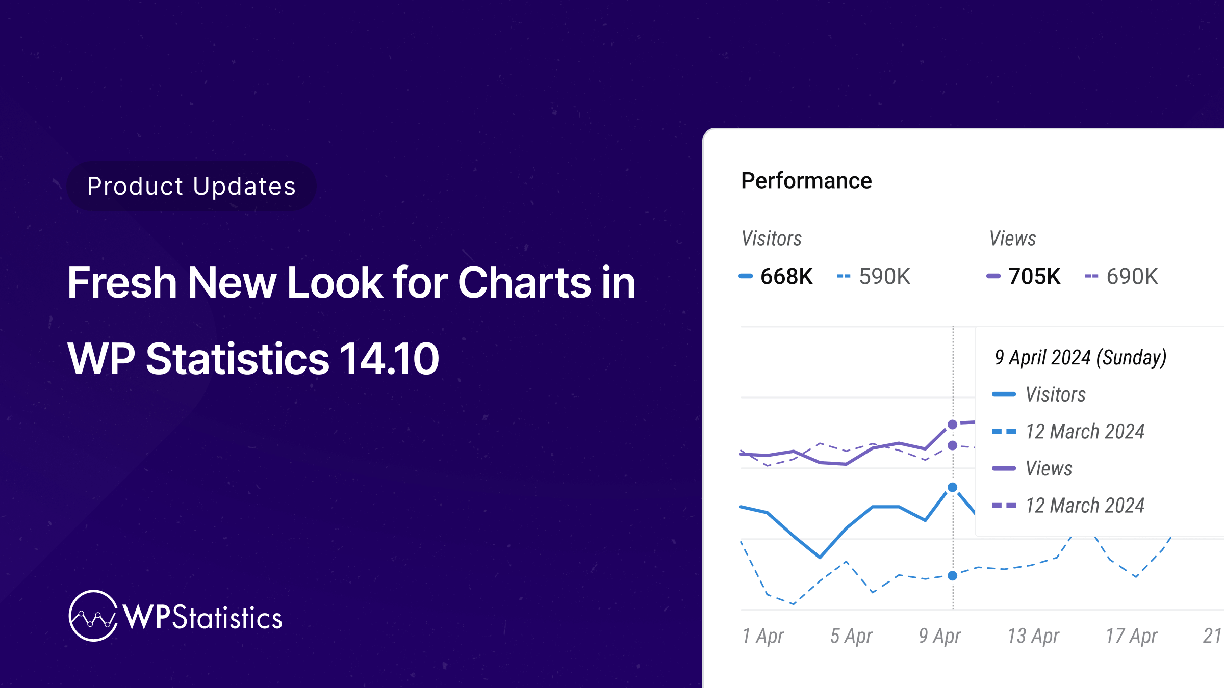
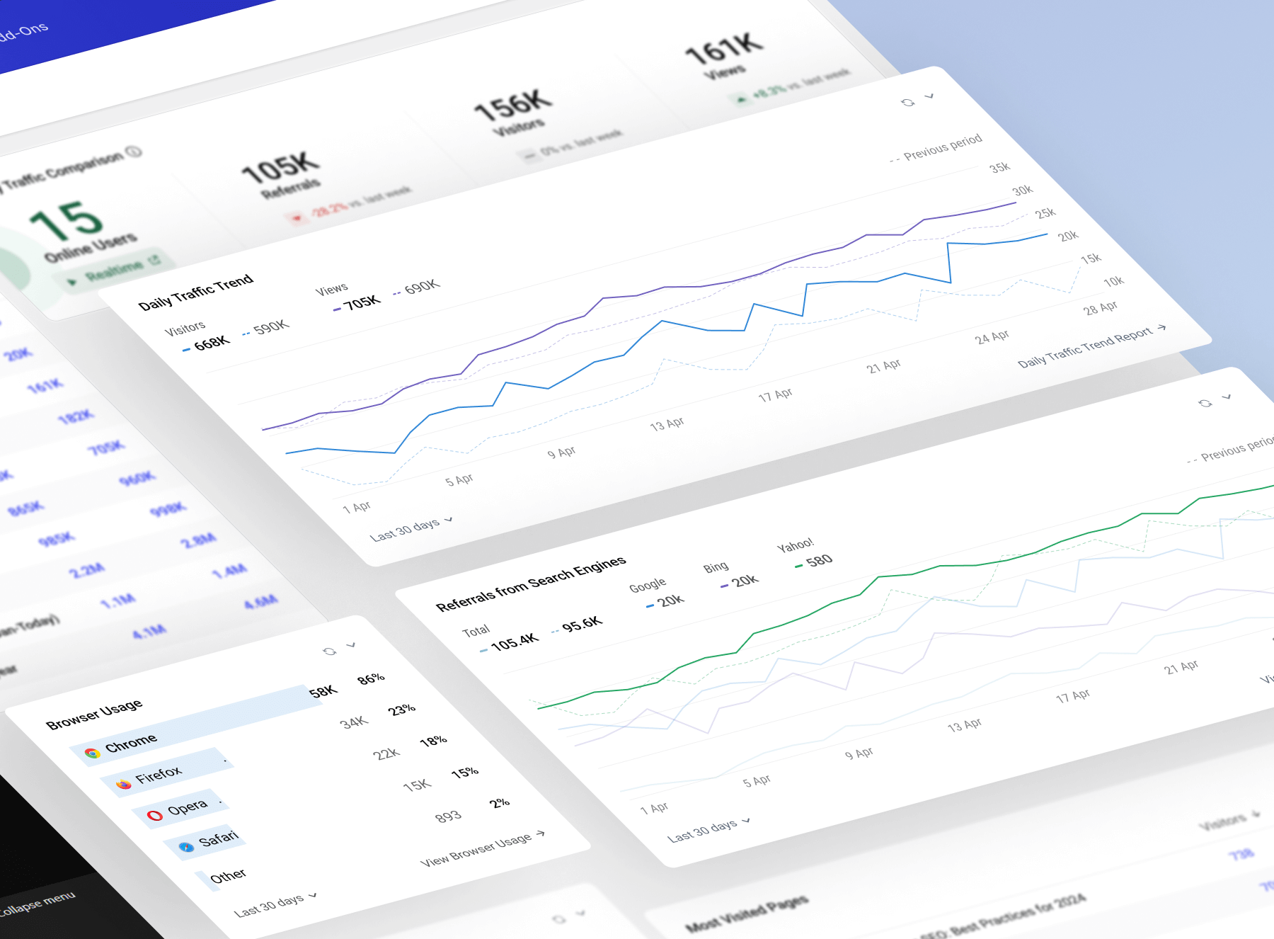
The charts have been completely redesigned in WP Statistics Version 14.10. They now look much better and are easier to read and understand. To provide you with the insights you need to optimize the performance of your website, we have worked hard to enhance their clarity.
Redesigned Charts: Better Look and Improved Readability
The charts have been redesigned in Version 14.10. Their look has been simplified to make them more visually appealing. With these updates, you can quickly see key data points and trends at a glance. Whether tracking visitor activity, page views, or content performance, the new chart design provides a more straightforward way to see what’s happening on the site.
Previous Period Indicator: Compare Trends Over Time
Along with the chart redesign, a Previous Period Indicator feature has been added. You can now compare current data with data from a previous period directly within the charts. As a result, changes and trends are easier to detect over time, allowing for a better understanding of the website’s performance and adjusting where necessary.
Why These Changes Matter
We made these updates to WP Statistics to make it more user-friendly and intuitive. Having clear, straightforward charts and the ability to compare data over time will help you make better decisions about the content, marketing strategies, and overall performance of the website.
More Exciting Features in Version 14.10
The redesigned charts and previous period indicator are just part of the many improvements introduced in WP Statistics Version 14.10. Be sure to check out the full release notes to see all the new features and enhancements available.
Stay tuned for more updates, and thank you for using WP Statistics!